
The other type of hotspot you can add to your overlay is Pano Link. This hotspot allows you to move between rooms/panoramas, to join them into a combined virtual tour. With Pano Link, visitors can spend less time exploring a building and go from one pano to another pano easily. The visitor simply clicks through the hotspot to reach the next rooms/panoramas and discover what inside from different views and angles. It is very suitable to show building directories such as houses or buildings with multi-stories.
How to create a Pano Link on GoThru overlay editor?
1. Click the “+” button (A key) on the plug-in manager on the top left corner of your Overlay editor screen and select the Pano link hotspot.
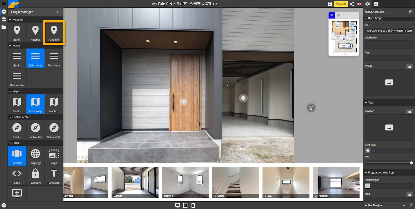
2. You will find a round white marker (hotspot icon) that appears exactly in the middle of the active panorama. Click and drag the representative icon to adjust the position of the hotspot. You should be careful not to place two hotspots too close to each other, which is easy to click at once.
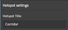
3. To give a title to the intended hotspot you can click on the hotspot title, type the title in the column under hotspot title.
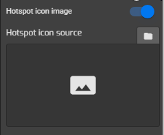
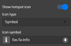
4. Change the hotspot symbol using your own SVG image. Click on the “hotspot image” then choose the image you have uploaded to the asset library.
To add the icon, change the show hotspot icon to “show”. GoThru now supports more than 3000 icons.
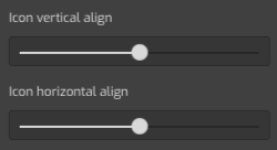
5. Adjust the icon alignment using vertical and horizontal alignment slider.
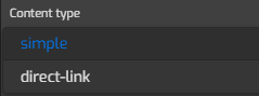
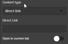
6. Add content to the hotspot by clicking on the content type. It will open options in which you can select the content type for the hotspot. There are two content options - Simple and Direct-link.
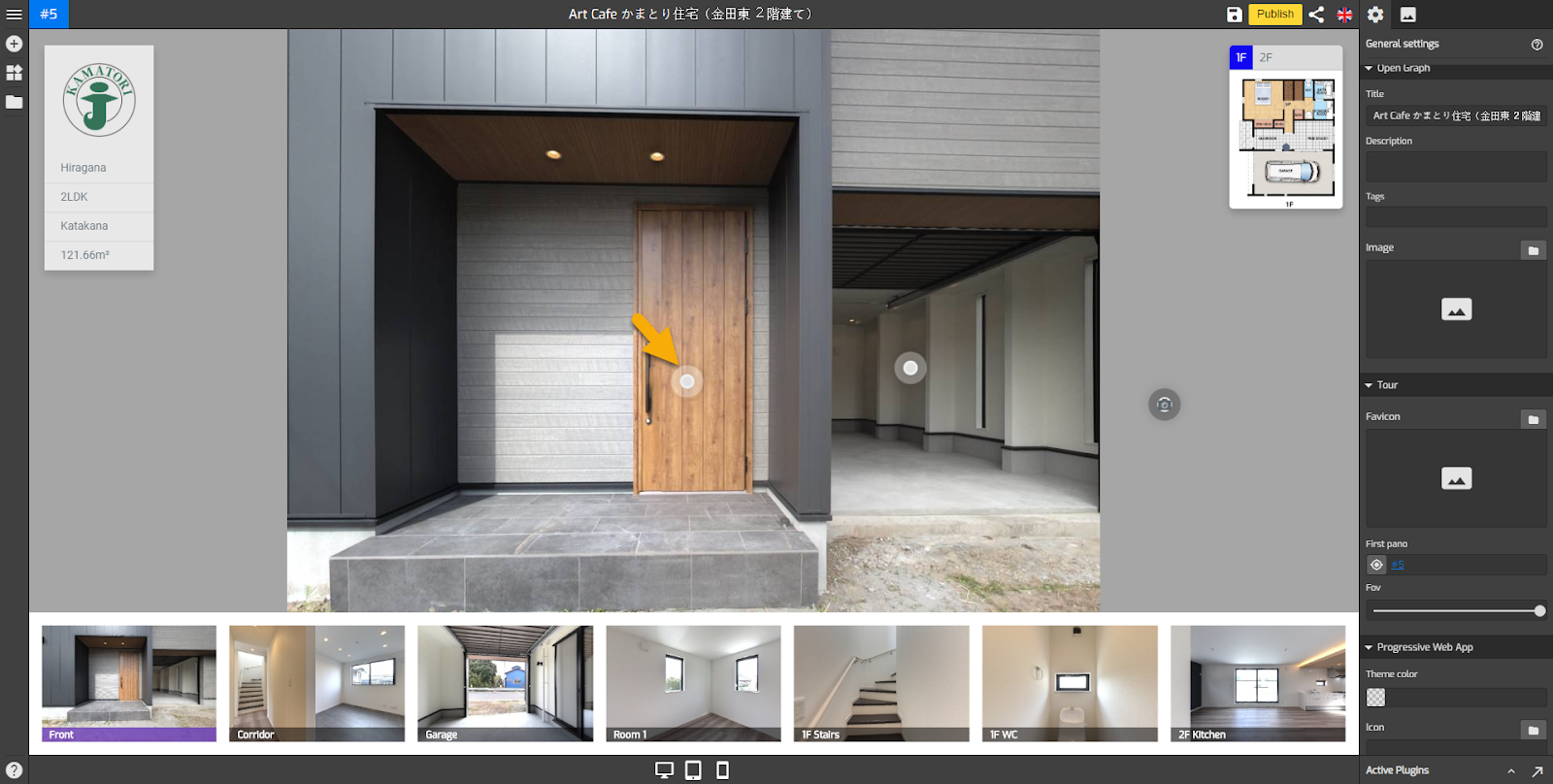
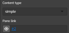
7. “Simple” adds and links a pano to the hotspot, select a pano from the pano list then click on “choose this pano” button.
8. “Direct link” adds a website URL to the hotspot. Use Open in the current tab to set the link is opened in the same tab or loaded into a new window.
9. Now you have interactive and responsive Pano Link hotspots on your tour. Once you are happy with your hotspots, just click “Save” and “Publish” to see the results.
Available hotspot setting tools
The Pano Link uses options which can be set in the same way as other hotspot options, and these are the available options under the hotspot setting:
Hotspot Title: gives title to the intended hotspot.
Hotspot title always shows: sets the hotspots to “always show” or “hide”
Hide hotspot icon: sets the hotspots to “hide” and content to “auto open”
Hotspot centering: applies a fixed position to the hotspot regardless of the pano`s view/position.
Hotspot icon image: changes the hotspot symbol using SVG image from the asset library
Hotspot pulse: activates a pulse effect to the hotspots to indicate interactivity
Hotspot background color: sets the color of the hotspot background.
Hotspot pulse color: sets the color of the hotspot pulse effect color.
Hotspot dot background: sets the color of the hotspot dot background color.
Hotspot icon size: adjusts the size of the hotspot icon, slide the bar to the right to enlarge the icon.
Show hotspot icon: sets the hotspot icon to be displayed or hidden.
Icon type: changes the hotspot icon using existing Gothru icons or SVG images.
Icon color: sets the color of the hotspot icon.
Icon size: adjusts the size of the hotspot icon, slide the bar to the right to enlarge the icon.
Icon vertical align: controls the vertical position or orientation of the hotspot icon.
Icon horizontal align: controls horizontal position or orientation of the hotspot icon.
Common colors: sets the hotspot colors connect to colors which in the general setting
Background color: sets the color of the hotspot background
Active color: changes the colors of the active hotspot
Content type: adds information to the hotspot. You can select the content type of the hotspot, simple and direct link.
Simple: links a pano to the hotspot, select a pano from pano list then click on “choose this pano” button
Direct link: adds a website URL to the hotspot
Open in current tab: sets the link is opened in the same tab or loaded into a new window

