
You are looking at how to set a logo that adapts or “responds” to different screen sizes using the CSS recipes editor or the Styles feature. This can be easily done by setting the ready made code from https://recipes.tourmkr.com/.
To perform this operation, you can follow the steps below.
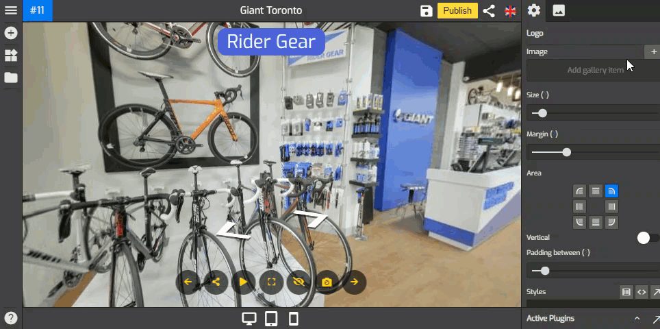
Step 1: Set up the logo
1. Click on the “+” icon (A key) to open the Plugin Manager for Hotspots, Menus, Maps, Control Center, and Other. Then click on Logo under the Other plugin option.

2. The logo settings appear on the right side of your overlay screen and make the desired changes.

3. Click “+” on Image to open the Asset Manager where you can upload a new image, or select one that’s already in your Asset Manager.
Step 2: Copy & Paste the CSS code
1. Go to the Styles section at the lower part of the logo settings.

2. Copy and paste the following CSS codes to the Styles section.
CSS code for a fix pixel value for your Logo (change 150px value to the value that works best for you) :
#overlay wdg-other-logo{
--width: 150px !important;
}

CSS code for responsive Logo size based on screen size (Change the pixel size based on the screen as you needed):
/* desktop logo size in pixels */
#overlay.desktop wdg-other-logo {
--width: 150px !important;
}
/* tablet logo size in pixels */
#overlay.tablet wdg-other-logo {
--width: 130px !important;
}
/* mobile logo size in pixels */
#overlay.mobile wdg-other-logo {
--width: 110px !important;
}

Step 3: Save & Publish
That's it! Your virtual tour with a responsive logo is now ready to be published. Just click the Save & Publish button at the top-right corner to apply the changes.

GoThru will always come with new features and ready made CSS code from https://recipes.tourmkr.com that allows you to customize other Overlay Editor plugins. So, stay tuned for more ready CSS codes!

