The hotspot is the main hotspot option on the Overlay editor. It's also known as the pulse hotspot because by default it appears with a pulse effect. Just like the other hotspot types, this also allows you to create a button with a popup window embedding a piece of content within a virtual tour. The hotspot now supports nine content types -- simple, HTML, Image-left, Image-top, video-top, image, video, audio, and iframe.
How to set up a hotspot?
1. Go to the plugin manager on the left and click on the “+” icon to open the Plugin Manager for Hotspots, Menus, Maps, Control Center, and Other. Then select the hotspot type.
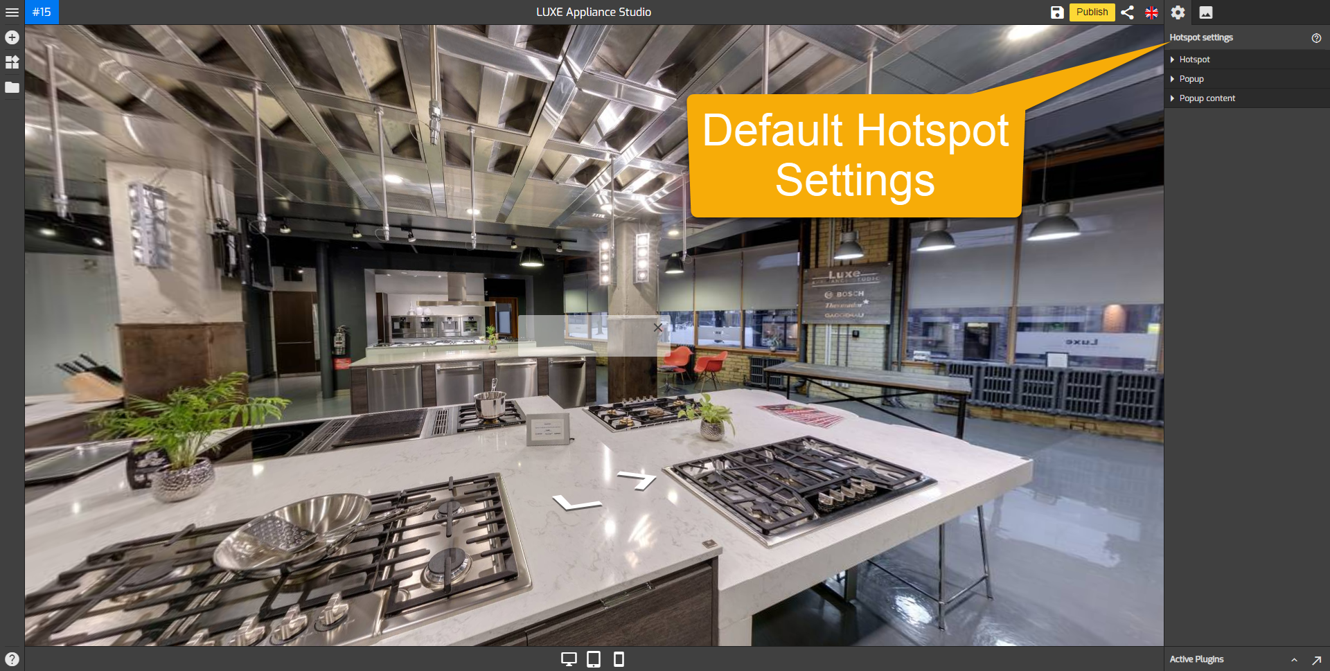
2. The hotspot icon with a pulse effect appears in the middle of the active panorama. Click and drag the icon to change the position of the hotspot. You should be careful not to place two hotspots too close to each other, which is easy to click at once.
3. The hotspot settings appear on the right panel consisting of three sections, hotspot, popup, and popup content. Set up the design and fill all the information about the hotspot. If you would like to make more significant changes to the hotspot or give the hotspot an entirely unique popup and contents, see “How to work with the hotspot settings?” below.

How to work with the hotspot settings?
The menus under the hotspot settings are made up of three sections: Hotspot, Popup, and Popup Content.
Hotspot
The hotspot section determines the main design of the hotspot. It is where you can enter the hotspot title, add the hotspot icon, and set up the hotspot configuration.
- Hotspot title: gives a title to the hotspot. Click on the hotspot title and type in the hotspot title field.

- Hotspot title always shows: sets the hotspot title to “always show” or “hide”.
- Hide hotspot icon: sets the hotspot icon to “hide” and content to “auto open”
- Hotspot centering: applies the hotspot position that's horizontally or vertically aligned with the middle of a panorama.

- Hotspot icon image: Changes the entire hotspot icon using a custom SVG image. Slide the toggle then click on the Hotspot Image to upload a new image, or select one that’s already in your Asset Manager.
- Hotspot pulse: activates a pulse effect to the hotspots to indicate interactivity. Slide the hotspot pulse toggle and set the colors of the pulse effect. Hotspot background color sets the color of the hotspot background. Hotspot pulse color sets the color of the hotspot pulse effect color. Hotspot dot background sets the color of the hotspot dot background color.
- Hotspot Icon: adds a symbol or an image that will be put at the center of the hotspot icon. It makes the hotspot unique to represent the marked object. To add the icon symbol or image, slide the hotspot Icon toggle and select the desired symbols or images. GoThru supports more than 3000 icons.
- Hotspot alignment: controls the position or orientation of the hotspot icon. Note that the icon symbol or image cannot be directly aligned with the hotspot icon, you can readjust its alignment using the vertical and horizontal alignment sliders.
Popup
Under the popup section, you can set up the style and preview customizations to your popups such as popup animation and its configuration.
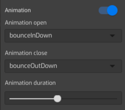
- Animation: adds an animation effect to the hotspot popup entrance and close. Slide the animation toggle then select bouncing, fading, flipping, rotating, sliding, zoom, or other special effects under the animation menu.

- Area: controls the positions where the hotspot popup appears. You can choose the center, top, bottom, left, or right side of your screen. Defaults to 'center'.
- Hotspot width and height: adjust the width and height of the hotspot popup. Move the slider to the right to increase the width or height.
- Margin: adjusts the distance between hotspot content to the end corner of the screen. Slide the slider to set up the popup margin.
- Border Radius: sets the roundness of the popup corners. Increase the value in each field to make a rounded corner and GoThru Overlay Border Radius will automatically adjust all four corners at once.
- Shadow depth: sets a shadow effect on the hotspot popup.
- Popup color menu: modifies the hotspot popup colors. It sets the color combinations so the popup can fit the entire virtual tour. Common colors set the popup colors to connect the colors in the general setting. Hotspot background color sets the color of the popup background. Active color changes the colors of the active hotspot. Text color sets the colors of the text in the popup. GoThru also supports gradient colors, available in 4 different directional gradients and a circular gradient.
Popup Content
The popup content section is where you can add content to the popup. This pulse hotspot now supports nine content types -- simple, HTML, Image-left, Image-top, video-top, image, video, audio, and iframe. Default to the simple content type. Click on the content type under the popup content settings to select a content type for the hotspot.
The following is the brief information about the types of content under the popup content section.
- Simple: sets a title with a brief explanation.
- Html: sets HTML code that embeds a webpage and its content.
- Image-left: sets an image with a caption on the right side.
- Image-top: sets an image with a caption appended to it.
- Video-top: sets a video with a caption appended to it.
- Image: adds an image only to the hotspot content.
- Video: adds video only to the hotspot content.
- Audio: adds audio only to the hotspot content.
- Iframe: embeds a webpage to the hotspot.
After filling all the information about the hotspot, click “save” and “publish” to see the results.


